Mr. Nobody tells the story of Nemo Nobody and the 3 different ways that his life could have turned out. These ways are described as he remembers them in a future reality where age is obsolete and being immortal is the common trend.
Tuesday, 13 December 2011
Wednesday, 7 December 2011
Location Scouting..
Today Phil and I went location scouting to Esholt Woods to look at sets and scenery for our film. The trip was incredibly successful as we gained a lot of valuable information which has helped our film progress in substance. We are still floating around some ideas but the general consensus is that we have settled on the idea of a girl in the forrest carefully picking her way through. This will be the opening scene of the film as well as some random shots of the forrest
 |
| Shot of a thick part of the forrest |
 |
| Shot of an open area of the forrest which was brightly lit |
 |
| Shot of the railway line at just about midday |
 |
| shot of the railway from on the bridge |
 |
| Parts of the forrest look like they're in different seasons. This looks like more like spring |
 |
| This shot looks almost summery because of the bracken, but without the bracken it would look like autumn or winter. |
 |
| Shot of a road going through the woods which could have the girl walking along it. This shot also looks more like autumn with the small patches of bright light and golden brown leaves |
 |
| shot of the river which could be one of the opening scenes |
Tuesday, 22 November 2011
Xbox 360 Video Research (Other Video Evaluation 2 of 5)
This video is an awful example of how bad an instructional video can be. There has been no editing and is all filmed in a single shot with a terrible quality camera. There are not many good points at all about this video and the voice over is often intermitted with 'umms' and 'errrs' which is very off putting for the person trying to understand the video.
The camera work is also very jumpy and often we cannot see where he is putting cables and how he is connecting them and so forth. This is a big problem for a video which is trying to teach people to do something
Tuesday, 15 November 2011
Xbox 360 Video Research (Other Video Evaluation 1 of 5)
I Have decided to do my instructional video on how to set up an Xbox 360. A simple idea with a particular focus on shot types and variation of these.
Pros & Cons of this Video
Pros
1. Good all round video explains clearly and effectively
2. Components are laid out nicely and makes it. again, easy to understand
3. Good shot variation
Cons
1. Long winded, could be wrapped up in a much shorter amount of time (which is what I intend to do)
2. Camera is shaky sometimes which can be annoying.
3. Narrator can be hard to understand, not his fault but could be solved by having writing and no voice.
Monty Python..
After being asked to construct an instructional video i looked at the instructional video for ' How to defend your self against fresh fruit' This is a sketch from the acting group Monty Python and is a parody on self defence training in the army.
It is interesting to see that even 'instructional videos' can be made into comedy sketches
Tuesday, 1 November 2011
The 'How to' Video..
I have been asked to create a 'How to' instructional video and come up with ideas for this. It could be as simple as making a cup of tea, or as complicated as making a cup of coffee.......
FIRST IDEA: How to get drunk. Quickly
FIRST IDEA: How to get drunk. Quickly
Monday, 31 October 2011
Animation Sequence..

This is the sequence of images i used to create my animation. The animation starts with Piro's normal masked face and he slowly pulls off his mask. This worked much better than i first imagined but due to complications i couldn't turn it into a animation..
Jordan Buckley..

Buckley does a lot o ink drawings of random creatures and animals, often on commission. I love the level of detail he goes to like the reflection in the eyes or the hair in the fur..
Gabriel Ba..

Ba is one of the main artists who has inspired me throughout this project. His collaboration with Gerard Way to create these characters was how mine was in itself created. His superheroes (such as Space Boy. above) Show a good deal of similarities to 'Watchmen'. I like the dark colours he uses and the sharp lines for his characters to make them look gruff and battle worn.

Above is 'The White Violin' a very interesting character in terms of her powers and her motivation. After being cast out of her family of super naturally gifted brothers and sisters she turns to evil and is transformed in the 'White Violin' by an evil organisation. Her powers come in the form of cataclysmically destructive music which she uses to try and destroy the world.
These weird powers made me think to try something different and give Piro No supernatural abilities but just the perception that he has. For example he can run incredibly fast over long distances
Tara Rueping..

I looked at Tara Rueping because (in this image) her characters are
cartoon like, and after reading the Umbrella Academy I realised, so
was mine. However her characters show more cartoon traits, such as:
unrealistically long arms and legs etc, where as mine is just a normal person
who has been 'cartoonified'
Elevations..
back to the environment again..

These are the 3 elevations of my environment, showing all the objects and features of the perspective environment in a simple 2d format. This makes it easier to see how large an object actually is. For example you can tell the sofa in the bottom left image (sofa in bottom left corner) is quite low in comparison to the high table on the right.

These are the 3 elevations of my environment, showing all the objects and features of the perspective environment in a simple 2d format. This makes it easier to see how large an object actually is. For example you can tell the sofa in the bottom left image (sofa in bottom left corner) is quite low in comparison to the high table on the right.
Storyboard..

Above is my story board showing Piro doing 3 actions.
1. Piro's normal expressionless, masked face.
2. Piro grasping his mask and pulling down.
3. A, still, emotionless face underneath.
1. Piro's normal expressionless, masked face.
2. Piro grasping his mask and pulling down.
3. A, still, emotionless face underneath.
Sunday, 30 October 2011
Alex Drummond..

The above image is by Alex Drummond and the reason i chose this is because of the intimacy of the room. A small confined space with everything someone needs. This is much like Piro's home. He only has things he needs and there is little space for clutter and non necessary items.

This is another example of an intimate room. There is not much 'stuff' or clutter and this relates more to my character as the room is wooden, much like Piro's shack. I like the way the light pierces through the windows giving you a sense of the time of say being the early evening or later afternoon..

Although this is no representative of my characters environment (as its outdoors) this is the kind of size of community that people would be living in after a nuclear holocaust..
Artur Sadlos..

I really like this image of the basement from Call of Juarez as it shows off shadows and the bright light coming from the
staircase and illuminating the area below the stairs. I forgot to post this when i was looking at him and this image is part of the inspiration for my environment. Sadlos creates an environment which gives of a sense of fear as well as hope. The stairs being the hope and the 'way out' and the back of the room being dingy and dark.
Saturday, 29 October 2011
Piro's House (outside view)

The above image shows the four outside walls of Piro's home. The top right
as you can see has the signs and the bottom left has the door. The top left is the
back wall which has no distinguishing features.
Piro's Home (inside)..
 |
| This is the original image I used to base Piro's home on, as you can see there have been drastic changes. |
 |
| This is the environment before it was made into 'live paint' |
 |
| Post live-paint |
This is the inside of Piro's home. As you can see it is a very simple establishment
and has little comfort factor. This is due to the time he lives in and most luxuries
(like duvets and cushions) were destroyed in the nuclear holocaust. As you can see,
his weapons of choice are displayed around his home to make it look more like
Piro's. The painting in the left corner is a painting of Hermes the god he has 'faith' in.
However it is not so much a faith as a comparison due to his incredible fitness and stamina.
Signs..
 |
I created the signs above to make Piro's home seem a dangerous place to
outsiders. The left sign was made from a 'Flammable' warning sign and I
changed it so it looks like Piro's head. The right one I created using a different
kind of flammable warning sign. This time I created the word 'maniac' using the
shapes of the original letters, and I added Piro's name so it reads 'WARNING: Piro-maniac'
Wednesday, 19 October 2011
Watchmen Similarities to The Umbrella Academy..
The dark colours and contrast the use in watchmen is also indicative of the graphic novel itself. Umbrella Academy also uses dark colours and like watchmen the superheroes are a bit dark and more malicious. Such as Rorschach in Watchmen and The Kraken in Umbrella Academy
Piro Running Pose..

Above is an image of Piro running. I used this base from Posemaniacs.com so I
had something to work with. This is also the pose I will use for the final 4 images
we have to do.
Tuesday, 18 October 2011
Gerard Way - The Killjoys & The Umbrella Academy..
As I have previously mentioned my character 'Piro' has been inspired by Gerard Way and his comic book called the Fabulous Kill Joys. This was where I obtained a lot of the inspiration for Piro. However The Fabulous Killjoys was never formally published to my knowledge so it is difficult to get extracts from it to make reference to.
However, i did some research and found out that he had written another comic book series called 'The Umbrella Academy' which have been published as a series of graphic novels.
However, i did some research and found out that he had written another comic book series called 'The Umbrella Academy' which have been published as a series of graphic novels.
 |
| This is an extract from one of the books (not sure which one, i'll have to find out) As you can see the colours are fairly basic and ,to me, seem quite depressing. The drawing style reminds me of watchmen slightly |
 |
This is just one of the many graphic novels written by Way. I really like his (Gabriel Ba - the illustrator) drawing style, and I am please Piro has come out to look more like a comic book hero than a physical life like looking human being. This is only a short snippet of the 'The Umbrella Academy' and i look forward to exploring their universe in more detail when I blog more about it, and when i purchase a few of the novels themselves. |
Photos..
These photos below are experiments i did when taking pictures of a zippo style lighter with a Jack Daniels design on it. In each of these photos I have used different settings on the SLR to provide different outcomes and colours..
 |
| This one is a simple shot in the light box which gives a nice clean image and the writing on the lighter is easily readable |
 |
| This is again taken in the light box and I have opened the lighter so that the wicker casing and ignition cog are visible. I like the way the light reflects off both of these mechanisms making a gold colour. |
 |
| In this instance i opened the lighter and ignited it so I could capture the flame on camera. The flame appears to be hovering above the lighter which is a nice effect.. |
Modernism.
We had a lecture on modernism and its influences on our present day society and what it is. Modernism is not (as is commonly misconstrued) a style, it is a subjective experience. Artists were painting in a different way. The paintings were about the paint and the canvas itself, the brush strokes and how in areas the paint was thicker than others. This was a huge contrast to paintings which were of the subject not about the paint.
Modernism revolutionised the modern time as it started to affect technology and architecture, which in turn then affected the modernist ideals as well. The new technology which allowed people a new perception of their own reality. Tall buildings allowed people to view cities and landscapes from a totally new perspective, and like i said this affected the paintings done at the time.
Modernism was responding to changes in the world and the idea that 'new' was better gave a big anti-historic feel to it. Everything had to be new and this lead to a lot of construction in places like Paris and London.
Much like the paintings being about the paint and being more subjective this also arose in interior design and objects of desire like nice chairs started to follow suit. Chairs made of tubular steel were not made to look like they were not. Previously chairs were painted to add decoration and make the wood/metal look more appealing, now, people were saying that the material itself was beautiful and should be untreated.
Form now followed function and this meant that because it worked well that also made it look good.
This is the Breuer tubular steel chair. It was designed by Marcel Breuer and epitomises everything modernism stands for.
This painting by Joseph Van Sickle is another example of modernistic styles. Purely subjective as someone could perceive this as one thing and another person perceive it as something else. I for example see various different oddly shaped people standing on a background, which matches the colours of their bodies
Friday, 14 October 2011
Personal, Professional, Practice.
We had our first lecture on PPP and I learnt a lot about the human psyche and how other people perceive us. The lecture itself revolved mainly around the introduction to PPP, but also told us about learning to understand the people we work with. We also learned how do describe our attributes in professional terms and understanding the importance of language.
This made me think about the slide show we were asked to do for the beginning of our course. It may have seemed irrelevant but it did make us learn a little bit about each other, which in turn, made it easier to strike up a conversation with all these new people. This was therefore a successful exercise as it also helped our tutors learn something about us as well, such as: who likes presentations and who doesn't.
We were also taught about the value of being a good team player and how 'being a good team player' is a good perception of others to have of you as it shows you can be approachable and willing to compromise and cooperate.
As well as 'perceptions we learnt about demographics which are 'facts' about people. Such as: Social Class, age, ethnicity. These are all facts, but they don't really tell us anything about the person. Which is why knowing a bit about someone, such as their music taste and what sports they like are a better indicator of who they are.
We all judge people on appearances: on hair style and clothes, its bad but we all do it. We shouldn't stick to these judgements though. We should make judgments based on (I know it sounds cliche) whats in the inside.
Carl Jung
He described several Archetypes as how everyones mind is made up:
The Self - Your conscious and unconscious mind. Self esteem.
The Shadow - Sex life instincts and your dark side.
The Anima/Animus - Female side if you are a male and visa versa.
The Persona - The mask we wear - what we want people to think of us.
There is some truth to these descriptions, such as, the persona, everyone wants other people to see them in a certain way and we only remove this mask when we are comfortable with the other person/people. The others are more vague and you would need to see them to know that they were there but each of them has a certain part to play.
We were then asked to do this test which asked us to pick a letter from a choice of two (e.g. A or B) and underneath these letters were lists which described our personality in some way. My Personality test cam out as ENFJ. This described me as a 'Charming team player type person' this is not necessarily a fact as the test isn't fool proof but it lets someone else know what i'm like.
Wednesday, 12 October 2011
L ) V E..
At the weekend just gone by I visited the Odeon in Camden, London to view a very special film hosted by the Sci-Fi Film Festival London. The film was particularly special to me as the executive producer, Tom DeLonge, is favourite musician of mine and the soundtrack was done by one of his bands 'Angels & Airwaves'. It was directed by William Eubank, who has worked on many film sets but this is debut as a director. On a side not Eubank often does camera work himself and I admire his conviction as he does some of the work and does not just delegate.
The film itself was entitled LOVE and this gave no indication to me as what the film could be about. But through the opening sequences it all becomes abundantly clear. The film is set around the undeniable importance of the human race having relationships and the important of love. It also shows the effect of story telling and theses stories which can form relationships.
The film follows the life of Captain Lee James Miller aboard the ISS space station doing a solo mission. This is what we get from the information provided to us and the hints in the environment and set. We are never directly told that he is alone, to start with, but the empty halls and soft music shows there is no other life about from the Captain aboard the ISS. The loneliness aboard the ISS is furthered by (among messages from Houston) a message from his brother announcing that he has a new born baby nephew. Miller's expression can only be described as a 'forced smile' as he is happy that he has a nephew and wants to show his brother this. But sad because he can't see him and that he is so far away from his family.
LOVE often cuts back to scenes from an American civil war soldier named Lee Briggs. He is a solider entrusted with an important mission which means he must travel away, from fighting the confederates, and perform this task to help further the cause to abolish slavery. This cut back and forth between the two times helps plant seeds in your mind of the interesting parallels between Lee Briggs's and Lee Miller's lives.
When we return to aboard the ISS we are shown a horrific incident has occurred. Silence is maintained on all radio channels to Houston and after hours of trying to send messages, both vocal and pre-recorded, he realises he has been abandoned. This truth is then further clarified when he receives an audio message from Houston telling him he cannot be brought back to Earth. As this truth slowly sinks in to our Captain's mind he goes through almost the five stages of grieving, which terminal patients often go through.
Denial - The captain cannot believe this is happening and constantly tries to contact Houston
Anger - The denial stage flows over into this after we see him breaking equipment and screaming in frustration.
Bargaining - The look of longing in his eyes as he stares out of port holes at Earth tells us all we need to know.
Depression - He starts to cry a lot and the look of longing and the melancholy expressions on his face show us this stage clearly.
Acceptance - This stage is slightly different as he accepts his fate, but also starts to hallucinate a lot and talk to him self. The loneliness gets to him and sends him mad. Often his hallucinations become almost comical to us viewers.
Obviously the film is not identical to these stages but there are similarities and the acceptance stage spills over into a psychotic breakdown from the crushing loneliness, however.
We are later told (by the captain) that he has been trapped on the ISS for 6 years. This is also the first time we are told the date, 2039, which is shocking as you assume its the present day. Miller is on the ISS for 6 years as the film shows us, further telling us the excess of his ordeal.
This was not supposed to be an actual review of the film as i have missed out major details. This is because I want people to watch the film and be as in awe of it as I am. I did this as i wanted to explain the similarities between the grief stages and the films progression.
The Trailer..
Avenged Sevenfold - Little Piece of Heaven..
The video above is very interesting to me as it employs simple
animation and is fairly primitive in quality. This works really well as it
is easy to tell this was the intention. I like the way the skeletons narrate the video
in a sinister kind of way. The violin playing ones as well as the ones with the bibles
are explaining that if you commit horrific crimes you will go to hell or experience hell on earth.
This in a way makes the skeletons almost 'good' in comparison.
Tuesday, 11 October 2011
Piro Aiming a Rifle..

More drawings and developments of Piro in illustrator. Instead of drawing, this time, I used two images of soldiers off the internet to base my Piro's poses on. The top half of the body is from one picture and the legs and feet from another.
 |
| Top Half.. |
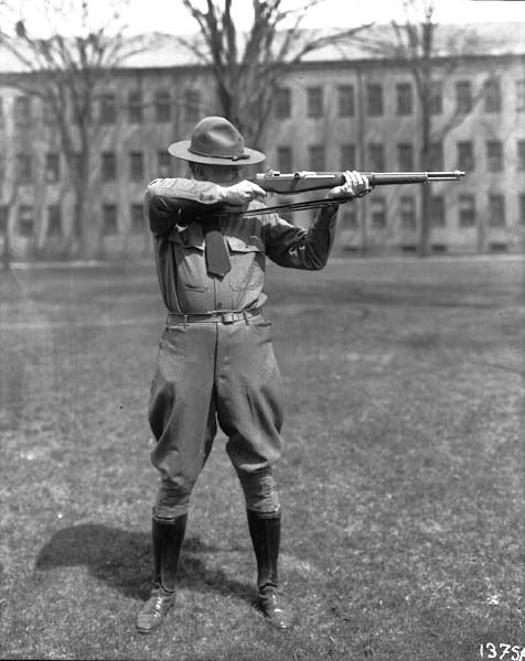 |
| Legs & Feet.. |
Thursday, 6 October 2011
Piro & Background..


These above are the latest versions of Piro I have done. These include tone, colour shading, mesh tools and a simple background. Amongst that I have added crease lines in the clothes as well as in the skin. I have added shadows and given his shoes a make over.
I have also changed the way the hair is coloured. Before the yellow in the hair was a random mess. After playing around with the mesh tool I realised that if I used the mesh tool on the tip of the hair spikes, the yellow faded down and looked a lot better.
Next time I am going to try and create a realistic background with tone and shading as well as developing Piro's poses..
Piro (sword pose)..


These are more experiments with my character in illustrator. Piro. this time, is in a different position and I have now added one of the weapons I designed previously. This time I have done an entire body
shape which took much longer but the results are much better. The colour and tone add a lot more to the image. However Piro's shape (shoulders) is not as good as I would like and this is what I am going to try and improve on next time..
My Chemical Romance - NaNaNa(NaNaNa) - Sing..
This video was a massive inspiration to me as
the main character (one shown in the preview), his
extravagance is what lead me to create Piro.
The video above is called Sing and is the second
half of the story told by NaNaNa.
The costumes and weaponry used in this is, again, what led
me to Piro
The video above is called Sing and is the second
half of the story told by NaNaNa.
The costumes and weaponry used in this is, again, what led
me to Piro
Piro In Illustrator..


These were my first steps into illustrator and using the pen tool
and the live paint bucket. The top left image is using just the pen
tool from a sketch I made. I scanned the sketch in and used the pen
tool to go around the outside to create a smooth shape. This is much
better than photoshop as the lines are pure and smooth.
The other images are some colours and effects I added using the 'live
paint bucket' tool. Using live paint bucket allows you too fill colour
in different parts of your image. I used the bucket tool to fill colour
the face, hair, glasses and bandana. The effects (most notably in the hair)
are done by using the 'mesh' tool. This creates a gradient and adds another
colour to the block colour. The best way to do this is find a lighter colour
to add subtle tones. This wouldn't work for the hair as it is many different
colours, so I used a yellow and it made this explosion of yellow which
was awesome! The bottom left image is the standard colours I use for Piro,
and (so far) out of these 3 this is my favourite. The bottom right is a
colour variation I tried out, which on reflection was not as good as the
original theme
Due to these colours being very bright, and the world he lives in being so
bleak, next time I am going to use darker colours to symbolise this.
Wednesday, 5 October 2011
Body Shapes..

As Piro is very athletic in build I researched and drew some leg shapes
in various running poses. This helps me understand where some muscles
are visible when they move (expand or contract) and when they are not
and therefore do not need to be drawn. It also helps me understand the
prominence of some muscles (such as the calf) and in cases like this they
 need to be given more shape and tone.
Tuesday, 4 October 2011
Danger Days..

The above poster is a fictional film poster composing the
members of the band 'My Chemical Romance' The reason
I post this is because this was a key part of my inspiration
for my character. The film (fictional though it maybe) is set in
California in 2019, after a nuclear holocaust. The four band
members: Gerrard Way, Mikey Way, Ray Toro and Franky Iero
make up a gang called the 'KillJoys'. Each of them has a 'code'
name: Gerrard becomes Party Poison, Mikey Becomes Kobra
Kid, Ray becomes Jet Star and Franky becomes Fun Ghoul.
Reasons this inspired me:
- The names and costumes they wear are very extravagant and
strange which is why my character has fire coloured hair.
- They produced two music videos for two songs 'Sing'
and 'NaNaNa(NaNaNa) These videos interlink and Sing
follows on from NaNaNa. The videos show them fighting an
evil corporation who have kidnapped a child. They are both directed
very well and, again, the costumes and props are interesting and weird.
Gas Mask..
 |

Piro with a gas mask on. I saw a was figure of a policeman in the royal armoury, and decided that I could use it on my character as a change of apparel
More Drawings of Piro..

These two images are drawings of piro observing the wastes through a telescope. I firstly found an image of a person gazing through a telescope and then simply changed that person into Piro by drawing him instead of the person.
The background i also changed as it didn't have those trees, also, the telescope didn't have the red markings on them. I changed them to make the telescope look more like Piro's possession. The long winter coat I have given him in this is to
represent the harsh environment of the wastes.

Subscribe to:
Comments (Atom)